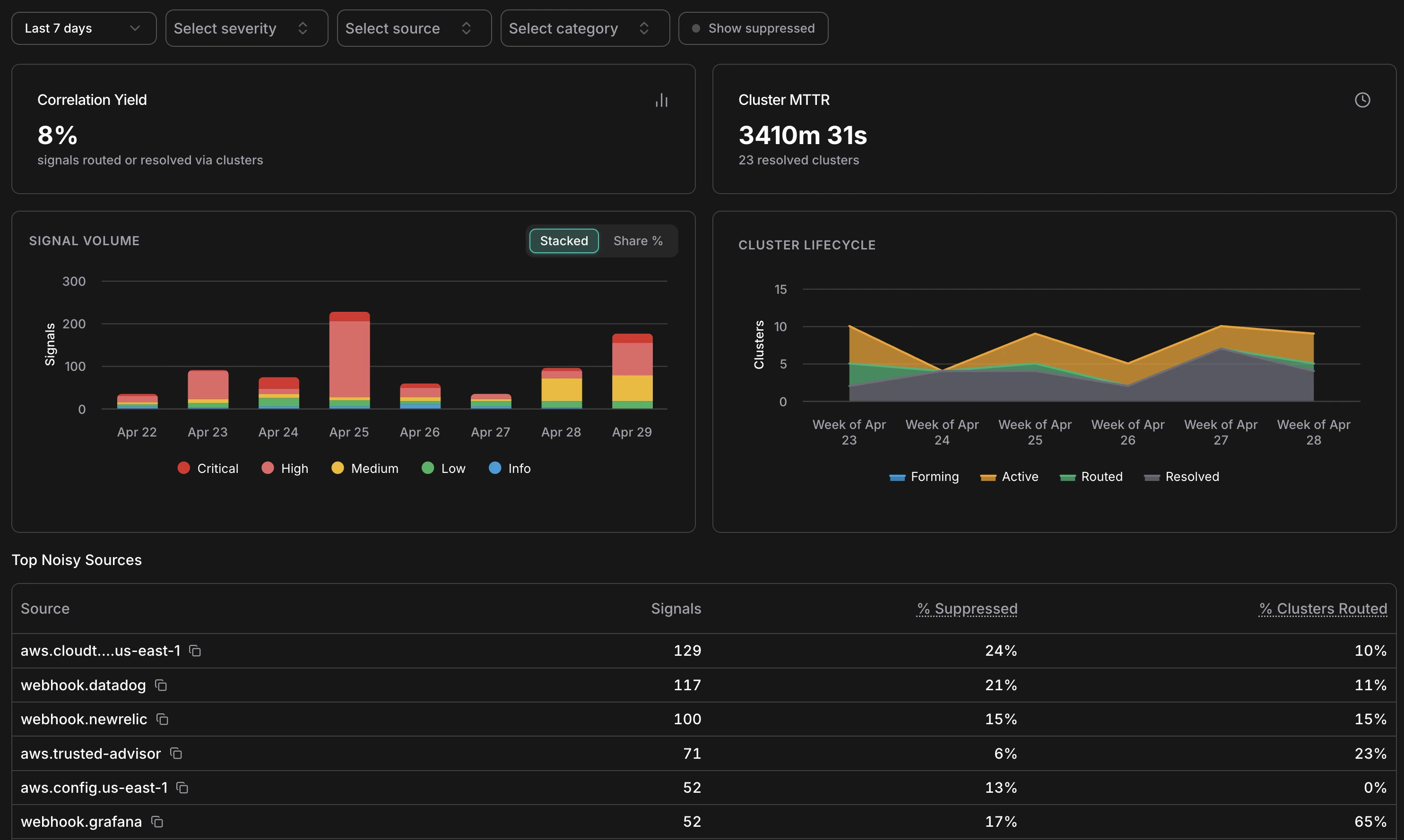
Analytics overview — KPIs, signal volume by severity, cluster lifecycle, and top noisy sources
The **Signal Volume** chart shows daily signal counts broken down by severity — Critical, High, Medium, Low, Info. Use the **Stacked / Share %** toggle to switch between absolute counts and proportional view. Spikes in this chart often correspond to infrastructure events (a deployment, a cost anomaly window, a security finding) rather than genuine problems — cross-reference with the Cluster Lifecycle chart to see how many of those spikes actually produced actionable clusters. *** ## Cluster lifecycle The **Cluster Lifecycle** chart shows how clusters distributed across statuses (Forming, Active, Routed, Resolved) over time. A healthy pattern shows most clusters moving from Active → Resolved without needing escalation to Routed. If Routed clusters are accumulating without corresponding Resolved entries, it may indicate incidents are being created but not closed — worth checking the Incidents list for stale open incidents. *** ## Suppression by reason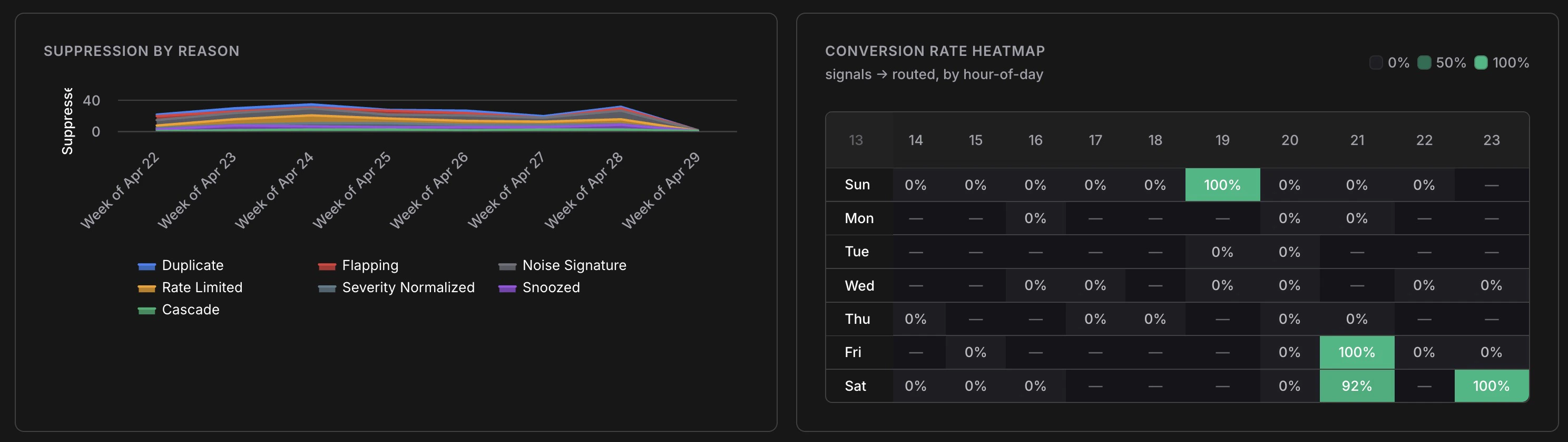
Suppression breakdown over time and signal-to-incident conversion rate by hour of day
The **Suppression by Reason** chart breaks down which of the seven suppression layers are firing and at what volume. Key things to look for: * **Duplicate dominating** — normal; means your sources are emitting redundant events as expected * **Rate Limited spiking** — a source may be misconfigured or experiencing an alert storm * **Flapping increasing** — a resource is oscillating; worth investigating the root cause * **Snoozed growing** — your team is managing noise manually; consider whether a permanent noise signature rule would help *** ## Conversion rate heatmap The heatmap shows signal-to-Incident conversion rate broken down by hour of day and day of week. Green cells (100%) mean every signal in that window became an Incident; empty cells mean no signals arrived. Use this to understand when your most actionable signals arrive — useful for on-call scheduling and for identifying patterns (e.g. cost anomalies that reliably surface on weekend mornings after batch jobs run). *** ## Top noisy sources The **Top Noisy Sources** table ranks sources by signal volume with three columns: | Column | What It Tells You | | --------------------- | ------------------------------------------------------ | | **Signals** | Total signals from this source in the selected period | | **% Suppressed** | How much of that source's output was filtered as noise | | **% Clusters Routed** | What fraction of its clusters escalated to an Incident | A source with high signal volume, low suppression, and low routing (e.g. `aws.config.us-east-1` at 0% routed) is generating many signals that don't result in action — a candidate for tuning or snoozing specific patterns. A source with high routing (e.g. `webhook.grafana` at 65% routed) is highly actionable and worth investing in. *** ## Filters All charts respond to the filter bar at the top of the analytics page: * **Date range** — same presets as the main feed (1h to 30d, or custom) * **Severity** — focus on Critical/High only to measure the most urgent signal patterns * **Source** — isolate a single source to audit its noise profile * **Category** — examine cost vs. security vs. compute signals separately * **Show suppressed** — include suppressed signals in volume counts *** ## Related