> ## Documentation Index
> Fetch the complete documentation index at: https://docs.cloudthinker.io/llms.txt
> Use this file to discover all available pages before exploring further.

# Artifacts

> 包括的なレポートの生成、カスタムダッシュボードの構築、分析用データのエクスポート

Artifacts（アーティファクト）は、CloudThinkerエージェントが接続されたクラウドデータから生成するダッシュボード、レポート、グラフです。必要なインサイトを自然言語で説明するだけで、エージェントが数分でデータに裏付けられたビジュアルを構築します。

クラウドレポートを手動で作成するには、コスト、セキュリティ、監視ツールからデータを収集し、フォーマットとサマリーを作成する必要があります — すぐに陳腐化する、何時間もかかる専門家の作業です。CloudThinkerの `#dashboard`、`#report`、`#chart` ツールは、すべての[接続](/ja/guide/connections/overview)にまたがるデータを組み合わせて、単一のプロンプトから同じアウトプットを生成します。

## 仕組み

1. **質問する** — [CloudThinker Language](/ja/guide/language) の構文 `@agent #tool instruction` でプロンプトを送信します。
2. **収集する** — エージェントが接続全体でリアルタイムデータをクエリします: Cost Explorer、CloudWatch、データベースなど。
3. **生成する** — エージェントがグラフ、テーブル、文書によるサマリーを含むインタラクティブなアーティファクトを構築します。
4. **共有または自動化する** — アーティファクトをエクスポートするか、[定期タスク](/ja/guide/automation/tasks)としてスケジュールして、定期的に再生成されるようにします。

<Frame>
  <img src="https://mintcdn.com/cloudthinker/0IKJjKZJEIROke98/images/use-cases/actionable-dashboards/01-aws-cost-dashboard.jpg?fit=max&auto=format&n=0IKJjKZJEIROke98&q=85&s=4ac5b1a42bb6b60a8095714d3da51b39" alt="AWS cost dashboard with spending trends and cost drivers" width="2238" height="1262" data-path="images/use-cases/actionable-dashboards/01-aws-cost-dashboard.jpg" />
</Frame>

<p style={{textAlign: 'center', fontSize: '0.9em', color: '#666', marginTop: '8px'}}>
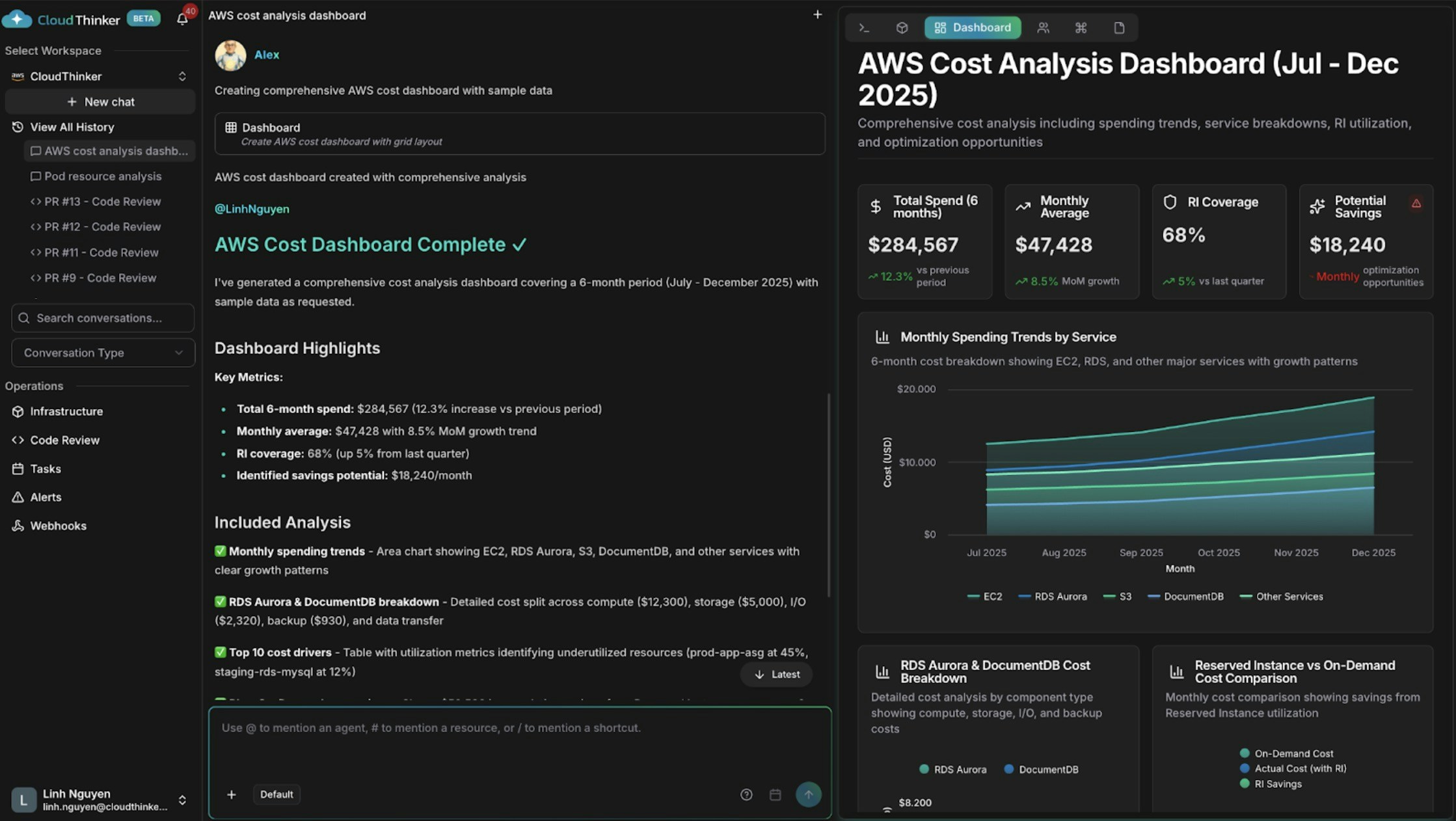
支出トレンドとコストドライバーを含むAWSコストダッシュボード</p>

## できること

| 機能            | 説明                                       | 詳細                                             |
| ------------- | ---------------------------------------- | ---------------------------------------------- |
| コストダッシュボードの構築 | AlexがサービスごとのコストトレンドやBreakdown、異常、予測をグラフ化 | [コスト分析](/ja/guide/cost-optimization/analytics) |
| インフラシグナルの相関分析 | Annaが複数クラウドの健全性、パフォーマンス、コストデータを一つのビューに統合 | [インフラ分析](/ja/guide/infrastructure/analytics)   |
| セキュリティ態勢のレポート | Oliverがコンプライアンス状況、オープンな調査結果、修正の進捗をサマリー化  | [Oliver](/ja/guide/agents/oliver)              |
| 依存関係の可視化      | ライブマップでリソース関係と影響範囲を探索                    | [Topology](/ja/guide/infrastructure/topology)  |
| 定期レポートのスケジュール | ダッシュボードやレポートを自動的に再生成して配信                 | [Tasks](/ja/guide/automation/tasks)            |
| 他システムへの結果送信   | アーティファクトイベントを外部ツールに送信                    | [Webhooks](/ja/guide/webhooks/overview)        |

## 主要な概念

| ツールタグ        | 生成するもの                    | 最適な用途                |
| ------------ | ------------------------- | -------------------- |
| `#dashboard` | 複数ウィジェットのインタラクティブなダッシュボード | 関連する複数メトリクスの継続的な可視性  |
| `#report`    | データ、調査結果、推奨事項を含むナラティブレポート | ステークホルダーへの報告、監査、レビュー |
| `#chart`     | 単一の焦点を絞ったビジュアライゼーション      | 一つのメトリクスや時系列トレンドの追跡  |

## プロンプトの例

一行のリクエストから始めましょう — エージェントがスコープと時間範囲のデフォルトを適切に選択します:

```text theme={null}
@alex #dashboard AWS spending by service for the last 30 days
@oliver #report quarterly security assessment across all accounts
@kai #dashboard cluster resource utilization
```

### コスト分析ダッシュボード

特定のBreakdownが必要な場合は、指示に構造を追加します:

```text theme={null}
@alex #dashboard Generate a comprehensive AWS cost dashboard for [start_date] to [end_date].

Include:
- Monthly spending trends by service with month-over-month growth rates
- Top 10 cost drivers and their utilization patterns
- Reserved Instance vs On-Demand cost comparison
- Cost anomalies and optimization opportunities with estimated savings

Segment by: [cost allocation tags such as environment, team, or application]
```

### クロスドメインダッシュボード

Annaに異なるシステムにあるデータを相関させるよう依頼します:

```text theme={null}
@anna #dashboard Create an operational dashboard correlating database performance with infrastructure costs for [time_period].

Analyze:
- Aurora and DocumentDB query performance metrics
- Resource utilization and spending patterns
- Correlation between database load and compute and storage costs

Context: [recent changes, migrations, or specific concerns]
```

<Frame>
  <img src="https://mintcdn.com/cloudthinker/0IKJjKZJEIROke98/images/use-cases/actionable-dashboards/02-database-infrastructure-dashboard.jpg?fit=max&auto=format&n=0IKJjKZJEIROke98&q=85&s=948166dc5e93d68dce7ae76ce7ab9061" alt="Database and infrastructure correlation dashboard showing performance and cost metrics" width="1672" height="1480" data-path="images/use-cases/actionable-dashboards/02-database-infrastructure-dashboard.jpg" />
</Frame>

<p style={{textAlign: 'center', fontSize: '0.9em', color: '#666', marginTop: '8px'}}>
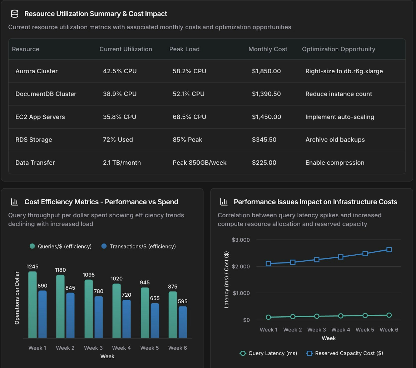
データベースとインフラの相関ダッシュボード</p>

### 焦点を絞ったグラフ

フルダッシュボードではなく単一のビジュアライゼーションには `#chart` を使用します:

```text theme={null}
@tony #chart Show query execution time trends for Aurora cluster [cluster-identifier] over the past [time_period].

- Metrics: p50, p95, p99 query latency
- Separate lines for read queries vs write queries
- Highlight queries exceeding [threshold] ms
```

<Frame>
  <img src="https://mintcdn.com/cloudthinker/0IKJjKZJEIROke98/images/use-cases/actionable-dashboards/03-aurora-query-performance-chart.jpg?fit=max&auto=format&n=0IKJjKZJEIROke98&q=85&s=7eda15a3292201adb072763cae9f3997" alt="Aurora query performance time-series chart with p50, p95, p99 latency metrics" width="1678" height="1254" data-path="images/use-cases/actionable-dashboards/03-aurora-query-performance-chart.jpg" />
</Frame>

<p style={{textAlign: 'center', fontSize: '0.9em', color: '#666', marginTop: '8px'}}>
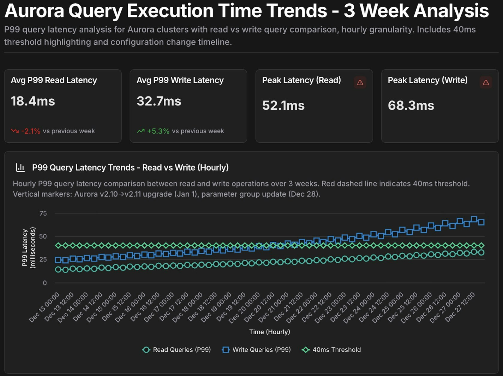
Auroraクエリパフォーマンスの時系列グラフ</p>

## 再利用可能なテンプレート

定期的な調査用にパラメータ化されたプロンプトをテンプレートとして保存し、実行のたびに `{variables}` を埋めます:

```text theme={null}
Template: database_performance_review
@tony #dashboard Create a performance dashboard for Aurora cluster {cluster_id} covering {time_period}.

Include:
- Slow query analysis (queries exceeding {latency_threshold} ms)
- Resource utilization trends (CPU, memory, IOPS)
- Replica lag monitoring
- Connection pool health

Compare against baseline: {comparison_period}
Alert on: queries exceeding p95 latency of {latency_threshold} ms

Template: cost_anomaly_investigation
@alex #report Investigate the cost anomaly for {service_name} on {date}.

- Compare costs to the 7-day and 30-day averages
- Break down by cost component (compute, storage, I/O, data transfer)
- Identify the specific resources driving the increase and quantify the impact
- Recommend immediate actions to mitigate ongoing cost increases
```

例えば、`database_performance_review` を `cluster_id=production-aurora-cluster`、`time_period="past 7 days"`、`comparison_period="previous 30 days"`、`latency_threshold=200` で実行します。

<Frame>
  <img src="https://mintcdn.com/cloudthinker/0IKJjKZJEIROke98/images/use-cases/actionable-dashboards/04-performance-review-template.jpg?fit=max&auto=format&n=0IKJjKZJEIROke98&q=85&s=d99f4fd1f4406daf2cfbbe70c18f5b1a" alt="Performance review dashboard template for Aurora cluster analysis" width="1682" height="1074" data-path="images/use-cases/actionable-dashboards/04-performance-review-template.jpg" />
</Frame>

<p style={{textAlign: 'center', fontSize: '0.9em', color: '#666', marginTop: '8px'}}>
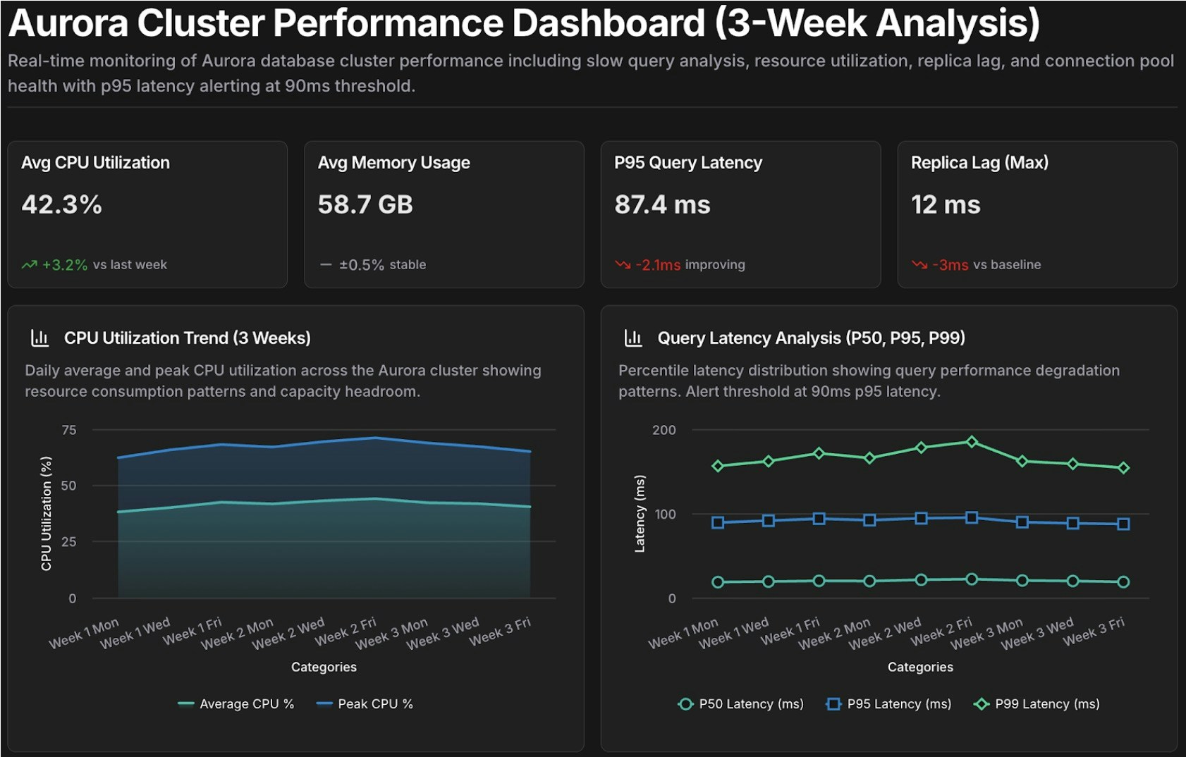
Auroraクラスター分析のパフォーマンスレビューダッシュボードテンプレート</p>

## 次のステップ

<CardGroup cols={2}>
  <Card title="コスト分析" icon="chart-line" href="/ja/guide/cost-optimization/analytics">
    支出トレンド、予測、コスト帰属分析を詳しく掘り下げる
  </Card>

  <Card title="インフラ分析" icon="server" href="/ja/guide/infrastructure/analytics">
    接続されたクラウド全体でパフォーマンス、コスト、信頼性シグナルを相関させる
  </Card>

  <Card title="CloudThinker Language" icon="code" href="/ja/guide/language">
    効果的なプロンプトを構築するための完全な @agent #tool 構文をマスターする
  </Card>

  <Card title="Tasks" icon="clock" href="/ja/guide/automation/tasks">
    ダッシュボードとレポートを自動的に再生成するようスケジュールする
  </Card>
</CardGroup>
