Artifacts are the dashboards, reports, and charts CloudThinker agents generate from your connected cloud data. Describe the insight you need in plain language, and the agent builds a data-backed visual in minutes. Building a cloud report by hand means pulling data from cost, security, and monitoring tools, then formatting and summarizing it — hours of specialist work that goes stale quickly. CloudThinker’s #dashboard, #report, and #chart tools produce the same output from a single prompt, combining data across all your connections.

How it works

  1. Ask — send a prompt using the CloudThinker Language syntax: @agent #tool instruction.
  2. Gather — the agent queries live data across your connections: Cost Explorer, CloudWatch, databases, and more.
  3. Generate — the agent assembles an interactive artifact with charts, tables, and a written summary.
  4. Share or automate — export the artifact, or schedule it as a recurring task so it regenerates on your cadence.
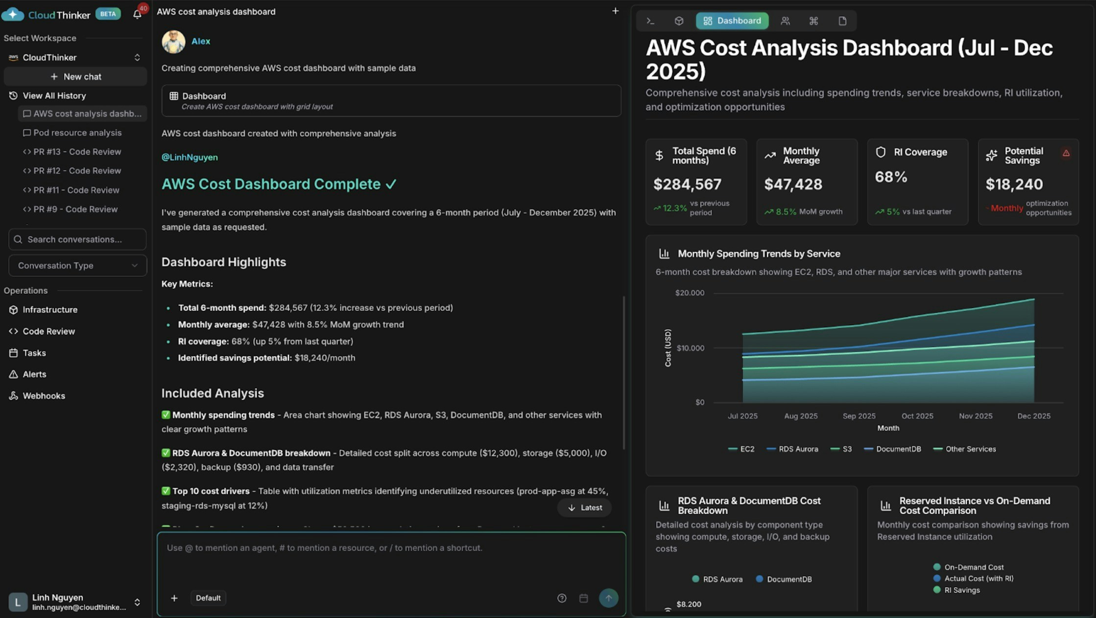
AWS cost dashboard with spending trends and cost drivers

AWS cost dashboard with spending trends and cost drivers

What you can do

CapabilityDescriptionLearn more
Build cost dashboardsAlex charts spending trends, service breakdowns, anomalies, and forecastsCost analytics
Correlate infrastructure signalsAnna combines health, performance, and cost data across clouds in one viewInfrastructure analytics
Report security postureOliver summarizes compliance status, open findings, and remediation progressOliver
Visualize dependenciesExplore resource relationships and blast radius on a live mapTopology
Schedule recurring reportsRegenerate and deliver dashboards or reports automaticallyTasks
Push results to other systemsSend artifact events to external toolsWebhooks

Key concepts

Tool tagProducesBest for
#dashboardMulti-widget interactive dashboardOngoing visibility across several related metrics
#reportNarrative report with data, findings, and recommendationsStakeholder updates, audits, and reviews
#chartSingle focused visualizationTracking one metric or trend over time

Example prompts

Start with a one-line request — agents pick sensible defaults for scope and time range:
@alex #dashboard AWS spending by service for the last 30 days
@oliver #report quarterly security assessment across all accounts
@kai #dashboard cluster resource utilization

Cost analysis dashboard

Add structure to the instruction when you need specific breakdowns:
@alex #dashboard Generate a comprehensive AWS cost dashboard for [start_date] to [end_date].

Include:
- Monthly spending trends by service with month-over-month growth rates
- Top 10 cost drivers and their utilization patterns
- Reserved Instance vs On-Demand cost comparison
- Cost anomalies and optimization opportunities with estimated savings

Segment by: [cost allocation tags such as environment, team, or application]

Cross-domain dashboard

Ask Anna to correlate data that lives in different systems:
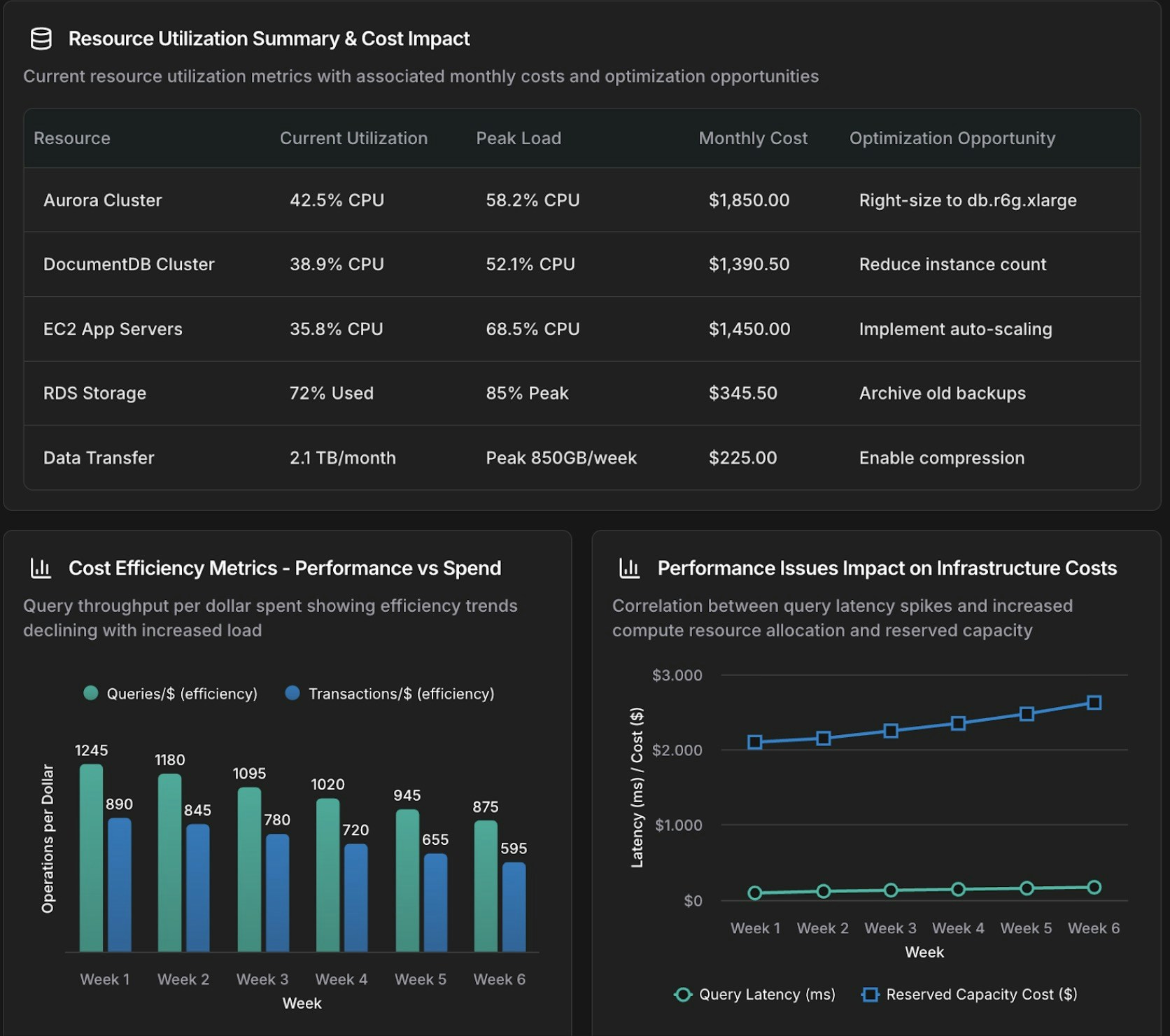
@anna #dashboard Create an operational dashboard correlating database performance with infrastructure costs for [time_period].

Analyze:
- Aurora and DocumentDB query performance metrics
- Resource utilization and spending patterns
- Correlation between database load and compute and storage costs

Context: [recent changes, migrations, or specific concerns]
Database and infrastructure correlation dashboard showing performance and cost metrics

Database and infrastructure correlation dashboard

Focused chart

Use #chart for a single visualization instead of a full dashboard:
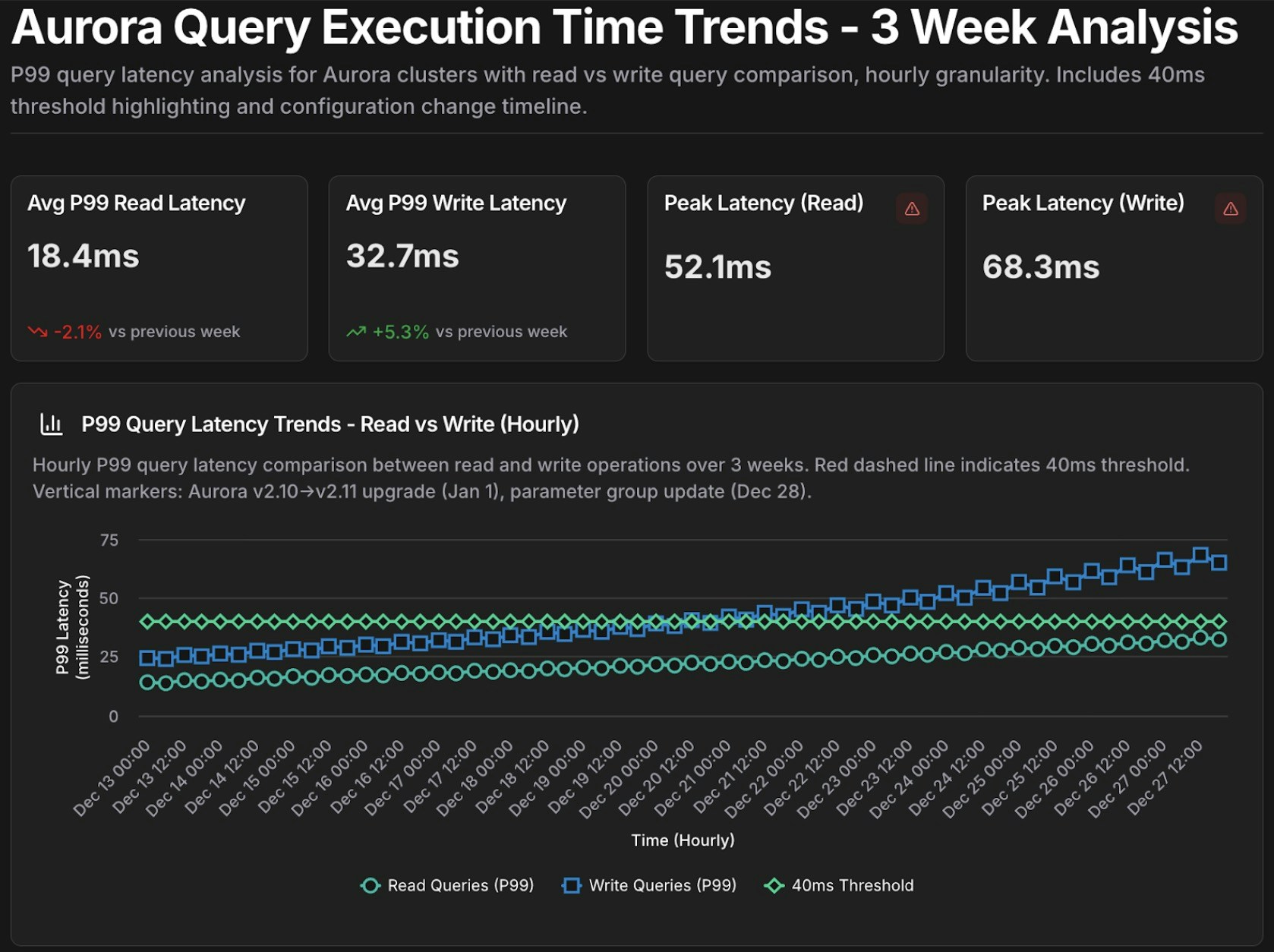
@tony #chart Show query execution time trends for Aurora cluster [cluster-identifier] over the past [time_period].

- Metrics: p50, p95, p99 query latency
- Separate lines for read queries vs write queries
- Highlight queries exceeding [threshold] ms
Aurora query performance time-series chart with p50, p95, p99 latency metrics

Aurora query performance time-series chart

Reusable templates

Save parameterized prompts as templates for recurring investigations, then fill in the {variables} on each run:
Template: database_performance_review
@tony #dashboard Create a performance dashboard for Aurora cluster {cluster_id} covering {time_period}.

Include:
- Slow query analysis (queries exceeding {latency_threshold} ms)
- Resource utilization trends (CPU, memory, IOPS)
- Replica lag monitoring
- Connection pool health

Compare against baseline: {comparison_period}
Alert on: queries exceeding p95 latency of {latency_threshold} ms

Template: cost_anomaly_investigation
@alex #report Investigate the cost anomaly for {service_name} on {date}.

- Compare costs to the 7-day and 30-day averages
- Break down by cost component (compute, storage, I/O, data transfer)
- Identify the specific resources driving the increase and quantify the impact
- Recommend immediate actions to mitigate ongoing cost increases
For example, run database_performance_review with cluster_id=production-aurora-cluster, time_period="past 7 days", comparison_period="previous 30 days", and latency_threshold=200.
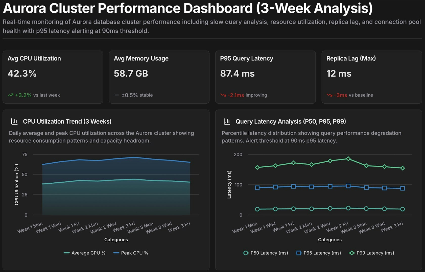
Performance review dashboard template for Aurora cluster analysis

Performance review dashboard template

Next steps

Cost Analytics

Dive deeper into spend trends, forecasts, and cost attribution analysis

Infrastructure Analytics

Correlate performance, cost, and reliability signals across connected clouds

CloudThinker Language

Master the full @agent #tool syntax for building effective prompts

Tasks

Schedule dashboards and reports to regenerate automatically