Key Metrics
Correlation Yield
The percentage of signals that were routed to an Incident or resolved via a cluster. A low yield (e.g. 8%) means most signals are being correctly filtered as non-actionable — that’s expected and healthy in a well-tuned setup.
Cluster MTTR
Mean time to resolve across all resolved clusters in the selected period. Tracks how quickly your team (and AI agents) close out correlated events once they surface.
Signal Volume
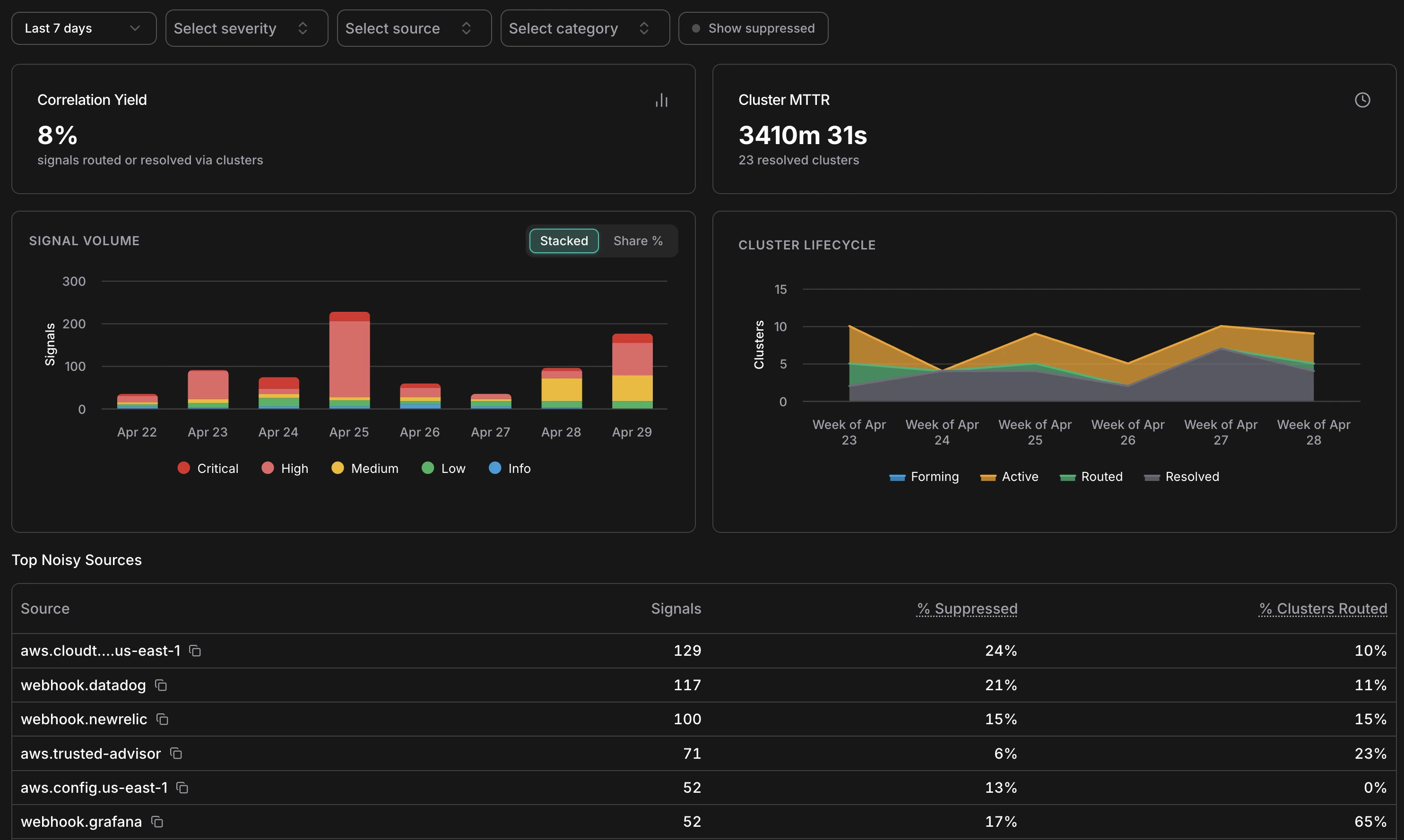
Analytics overview — KPIs, signal volume by severity, cluster lifecycle, and top noisy sources
The Signal Volume chart shows daily signal counts broken down by severity — Critical, High, Medium, Low, Info. Use the Stacked / Share % toggle to switch between absolute counts and proportional view. Spikes in this chart often correspond to infrastructure events (a deployment, a cost anomaly window, a security finding) rather than genuine problems — cross-reference with the Cluster Lifecycle chart to see how many of those spikes actually produced actionable clusters.Cluster Lifecycle
The Cluster Lifecycle chart shows how clusters distributed across statuses (Forming, Active, Routed, Resolved) over time. A healthy pattern shows most clusters moving from Active → Resolved without needing escalation to Routed. If Routed clusters are accumulating without corresponding Resolved entries, it may indicate incidents are being created but not closed — worth checking the Incidents list for stale open incidents.Suppression by Reason
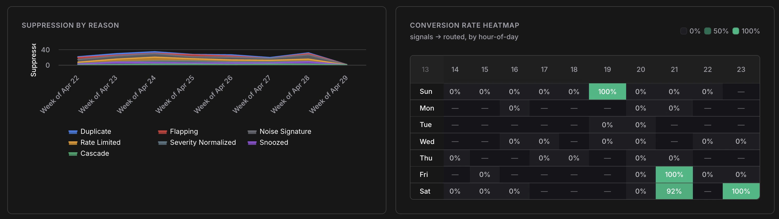
Suppression breakdown over time and signal-to-incident conversion rate by hour of day
The Suppression by Reason chart breaks down which of the seven suppression layers are firing and at what volume. Key things to look for:- Duplicate dominating — normal; means your sources are emitting redundant events as expected
- Rate Limited spiking — a source may be misconfigured or experiencing an alert storm
- Flapping increasing — a resource is oscillating; worth investigating the root cause
- Snoozed growing — your team is managing noise manually; consider whether a permanent noise signature rule would help
Conversion Rate Heatmap
The heatmap shows signal-to-Incident conversion rate broken down by hour of day and day of week. Green cells (100%) mean every signal in that window became an Incident; empty cells mean no signals arrived. Use this to understand when your most actionable signals arrive — useful for on-call scheduling and for identifying patterns (e.g. cost anomalies that reliably surface on weekend mornings after batch jobs run).Top Noisy Sources
The Top Noisy Sources table ranks sources by signal volume with three columns:| Column | What It Tells You |
|---|---|
| Signals | Total signals from this source in the selected period |
| % Suppressed | How much of that source’s output was filtered as noise |
| % Clusters Routed | What fraction of its clusters escalated to an Incident |
aws.config.us-east-1 at 0% routed) is generating many signals that don’t result in action — a candidate for tuning or snoozing specific patterns. A source with high routing (e.g. webhook.grafana at 65% routed) is highly actionable and worth investing in.
Filters
All charts respond to the filter bar at the top of the analytics page:- Date range — same presets as the main feed (1h to 30d, or custom)
- Severity — focus on Critical/High only to measure the most urgent signal patterns
- Source — isolate a single source to audit its noise profile
- Category — examine cost vs. security vs. compute signals separately
- Show suppressed — include suppressed signals in volume counts